Self-initiated · fictional brand/2026
Ficha Extra
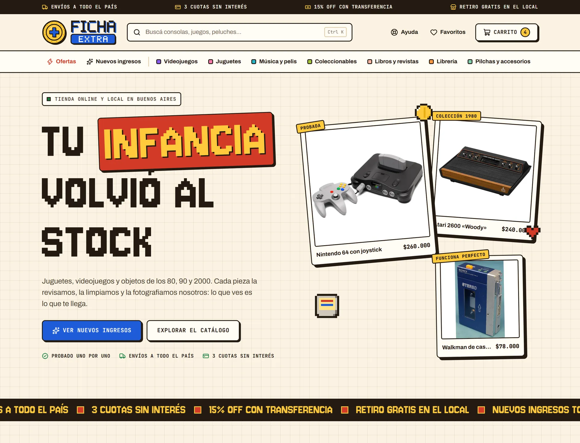
A self-initiated concept: a full online shop for Ficha Extra, a fictional Argentine brand of retro games, toys and collectibles, with its own logo, design system and clickable storefront.
(01) Overview
Ficha Extra is an invented brand: a shop selling games, toys and objects from the 80s, 90s and 2000s online and from a gallery store in Buenos Aires. It is not a commission but a personal project, made to show the full method on a realistic e-commerce case: brand, design system and a clickable storefront with home, catalogue, product page, cart, checkout, help and an about page, every component designed from scratch. The 47 products, their prices, stock, condition and descriptions are invented, written to feel like a real counter full of one-off finds.
Client
Self-initiated · fictional brand
Year
2026
Services
Design, Development
Deliverables
Fictional brand and logo, Design system, Clickable storefront prototype, Pixel art sprites, States board
(A) The Challenge
Collectors and grown-ups chasing their childhood usually find small retro shops buried in stock templates: every card repeats three prices, categories have no real filters and stock is invisible. Yet the catalogue is full of one-off pieces. The brief was a shop that carries the nostalgia without getting in the way of buying, on a phone as much as on a desktop.
(B) The Approach
- 01
Arcades and graph paper
Arcade cabinets, 80s and 90s console plastic, graph paper notebooks and the stickers on old game boxes led to one rule: the retro lives on the surface, clarity of use is not negotiable.
- 02
One colour, one job
Each colour has a fixed job: blue is reserved for actions, red for offers, green for savings and availability, yellow for highlights. If it is blue, you can press it.
- 03
The third pixel face
Large headlines use a pixel face, and it changed twice along the way: in Pixelify Sans the C read as an O, in Tiny5 the V looked like a U. Jersey 10 stayed.
- 04
A token with a plus
The logo is a yellow arcade token with a plus sign, the extra credit that names the brand, drawn exactly like the site's buttons so brand and shop speak the same language.
views designed: screens, mobile, modals and states
invented products across 7 categories
pixel typefaces tried before settling on Jersey 10
(02) Brand & Design System
Cream background with a subtle graph-paper grid, cards with a thick dark border and a hard offset shadow with no blur, in an 80s and 90s console-plastic palette where no colour changes role: if it is blue, you can press it. Jersey 10 carries large headlines and the logo, JetBrains Mono prices, stamps and data, Archivo body text and interface. The logo is drawn with the same colours, borders and shadows as the interface, so the brand and the shop never drift apart. Copy is rioplatense Spanish with voseo, the way a Buenos Aires shop speaks to its customers, with no emojis and no abbreviations.
Palette
Typography
Jersey 10
Tu infancia volvió al stock · $165.000
titulares grandes y logo, nunca por debajo de 28 px · JetBrains Mono para etiquetas, precios y datos · Archivo para texto corrido e interfaz
(03) The Product
Filters a stock template never has
Category chips mirror the header navigation, and the sidebar filters by stock, price range and condition, with counts per condition that follow the category. Cards carry stamps such as New arrival, Last unit or a discount, and a note reminds that used items show the actual piece.
Price in three lines, shipping before the cart
List price, bank transfer price and interest-free instalments, each on its own line, so the eye never has to untangle a block of numbers. Shipping is calculated on the page by postcode, with home delivery, branch pickup and free pickup at the shop. One-off pieces are flagged as unique and the last unit is called out right above the add button.
A side cart that keeps you browsing
Adding a product opens a side panel instead of leaving the page: editable quantities, the unit limit for single pieces, a free-shipping progress bar and the transfer total next to the subtotal. The full cart page adds a coupon field and cheap items to round up the order.
Three steps and a final price per method
A reduced header removes distractions at the moment of paying. Completed steps collapse into editable summaries, and each payment option shows its own final amount: transfer with 15% off, card or Mercado Pago in three instalments, and cash only when picking up at the shop.
Empty and error states in the brand's own language
Seven states designed, not left to chance: loading placeholders that mirror the real layout, no search results with WhatsApp as a way out, an empty cart reading Insert coin, a sold-out unique piece, a rejected payment with no charge made, and a Game over error with retry and a support code. The moments that usually frustrate become the ones with the most personality.
(04) The Outcome
Seven pages, three shared modals and a dedicated mobile layout, laid out as 30 views: 14 desktop screens, 5 mobile, 4 modals and 7 states. The product card keeps one hierarchy: price, transfer price and instalments on one line each. The catalogue gets real filters by stock, price range and condition, the cart opens as a side panel with a free-shipping progress bar, and the checkout runs in three steps with the final price shown per payment method. Help and About are fixed content, so they deliberately have no loading states. The result is a shop that feels like walking into the gallery store, and still lets a buyer go from browsing to paying without a single doubt.
Product photos: Wikimedia Commons contributors, under CC BY and CC BY-SA licences; full credits on the shop's About page.